
STAY TUNED
Contact Us


SmartArt Branding Portfolio
Since 1999, SmartArt Branding has completed numerous impressive projects that help our clients stand out in the marketplace.
Explore our gallery and see the impact we've made!
Legacy Series | Award Winners
SmartArt has produced award-winning content and unique designs for over two decades. Here are some of our favorites.
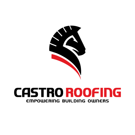
Hall of State Building
Multi-Award recipient
SmartArt Branding and Castro Roofing collaborate on this impressive project, which documents the complete replacement of the roofing system at the Hall of State building located at Fair Park, in Dallas, Texas.
Golden Hammer Award
DFW Topping Out Projects
Gold Circle Award
View the book by clicking the link below.
Cedar Hill Municipal Center
Multi-Award recipient
SmartArt Branding and Castro Roofing are collaborating on this impressive project, which documents the commercial roofing system at the Cedar Hill Municipal Center.
Golden Hammer Award
Gold Circle Award
View the book by clicking the link below.
Other Design Projects
Other designs through the years
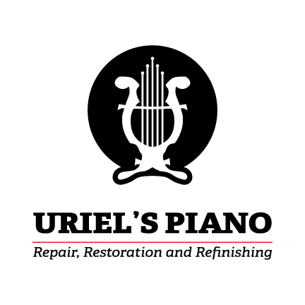
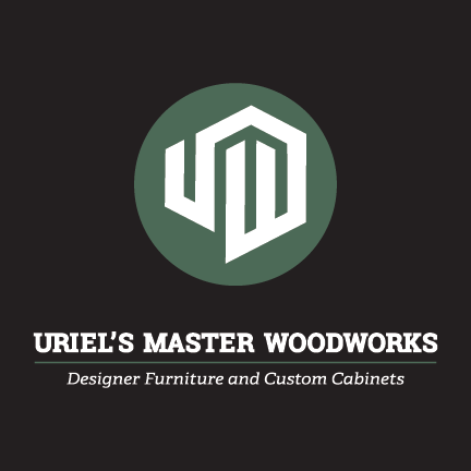
Uriel's Piano Refinishing
Creative Storytelling/Visuals: Poppie the Piano and Steinie VonGrande
These two samples illustrate how storytelling can be effectively expressed through whimsical tales and vibrant visuals that bring the narrative to life in a charming manner.
Both were used as blogs and subsequent social media posts.
Garland Water Utilities
Spoof Ads | Down the Drain
Garland Utilities formed an exciting partnership with SmartArt Branding to create a captivating and engaging campaign to raise awareness about the critical issue of not disposing of grease and other clogging materials in household drains. This initiative was not just about spreading a message; it was about doing so in a way that resonates with the audience through humor and creativity.
Our innovative strategy centered on developing a series of witty parodies inspired by well-known movie titles. By leveraging familiar cultural references, we crafted a campaign that ensures the essential message regarding proper disposal is enjoyable and memorable. This approach captures attention and effectively communicates the importance of maintaining clear drains in every household.
To bring this initiative to life, we completely revamped the digital poster samples and ensured they were available in various formats. These formats included traditional options such as billboards, magazine ads, newspaper advertisements, and digital outreach methods like emails and postcards.
Additionally, we provided flyers conveniently distributed with monthly water bills, ensuring that the message reached our audience in multiple ways and reinforced our commitment to community engagement. This multifaceted approach maximized visibility and fostered a greater understanding among residents about the need for responsible waste disposal habits.
Cavanaugh Flight Museum
Take Off! | Early Poster Design
This design actually predates SmartArt and was created in late 1993 by Jani-King International | Cavanaugh Flight Museum Art Director Ruben Amesquita.
It embodies the spirit of one of the inaugural events at the Cavanaugh Flight Museum and reflects the excitement and passion surrounding this special occasion.
The original depiction of the planes was made with pen and ink and colored pencils, which were then printed and assembled on cold-press board.
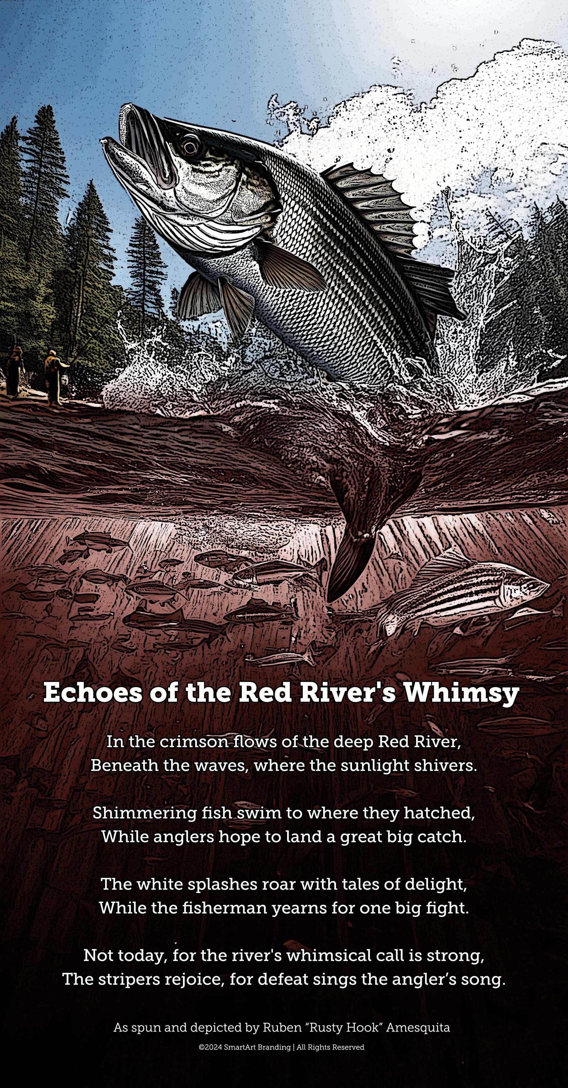
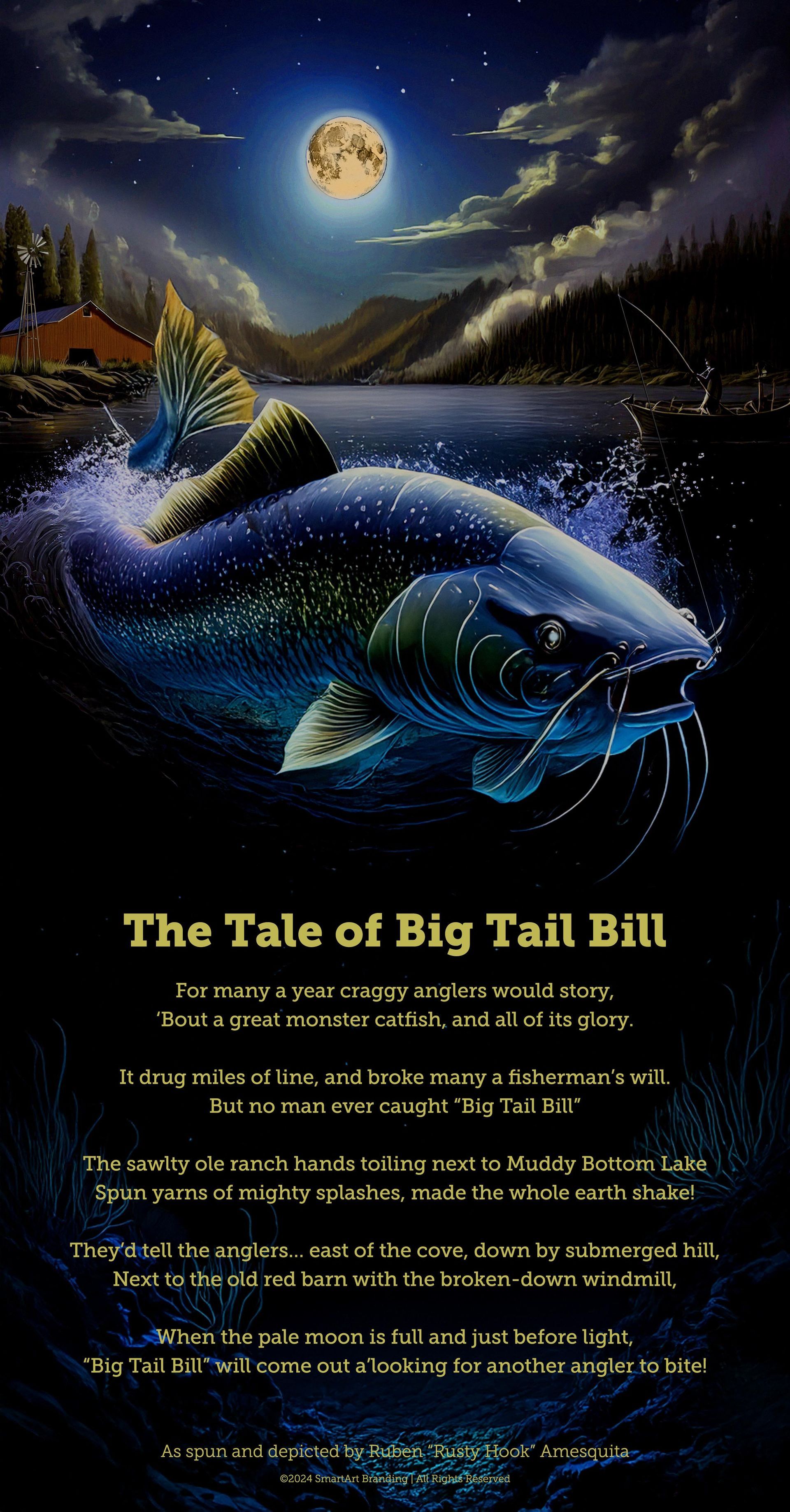
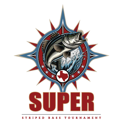
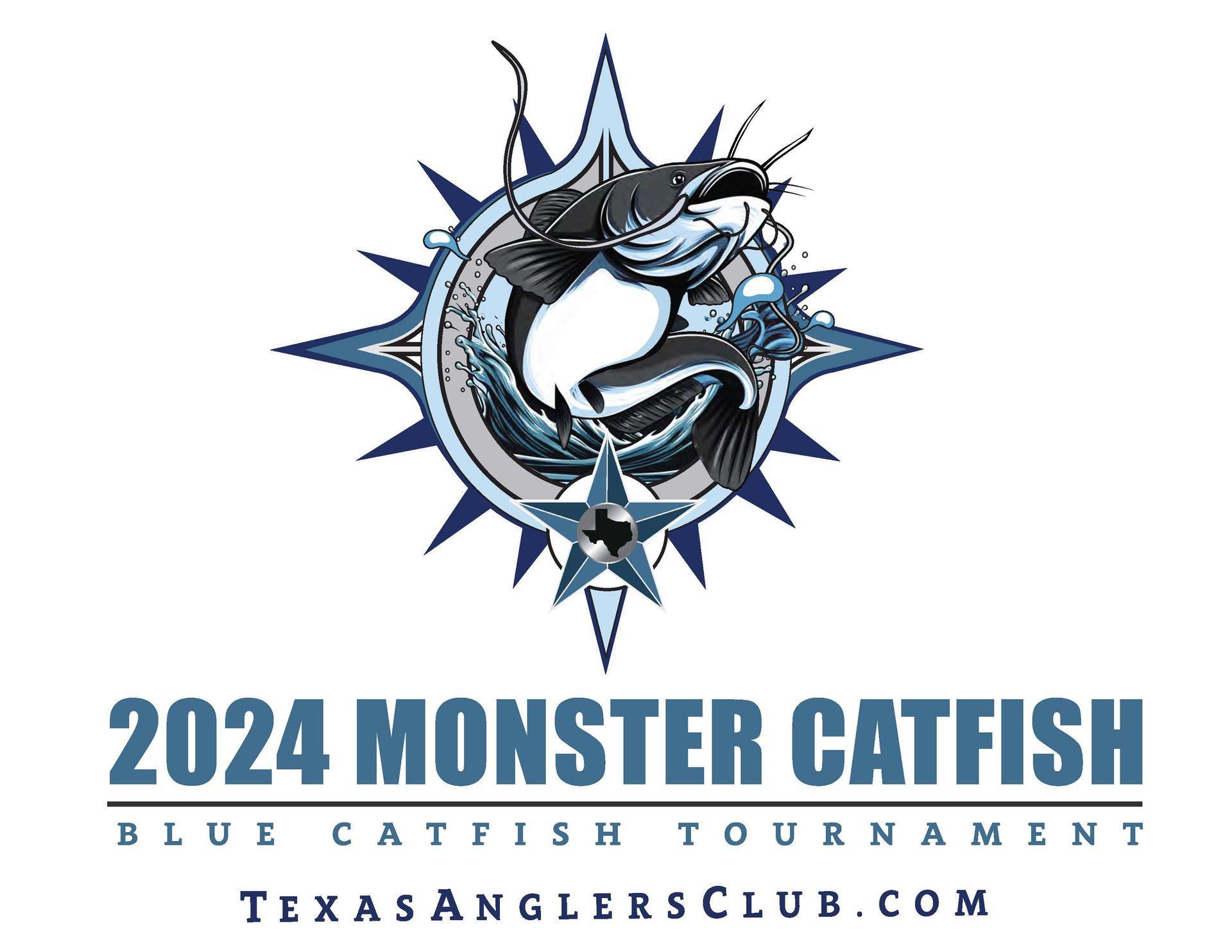
Texas Angler's Club
Creative Poems and Poster Designs
These two projects done for Texas Anger's Club demonstrate how storytelling can be effectively conveyed through poetry and vivid posters that bring the narrative to life in a captivating way.
Texas Angler's Club
Monster Catfish and Super Striper Tourneys Apparel Design and Production
Since 2008, SmartArt and our fantastic sponsors have been casting our lines in hopes of landing the big one!
We’re also excited to share some fun tournament history and marketing through the years! Please click the link below!
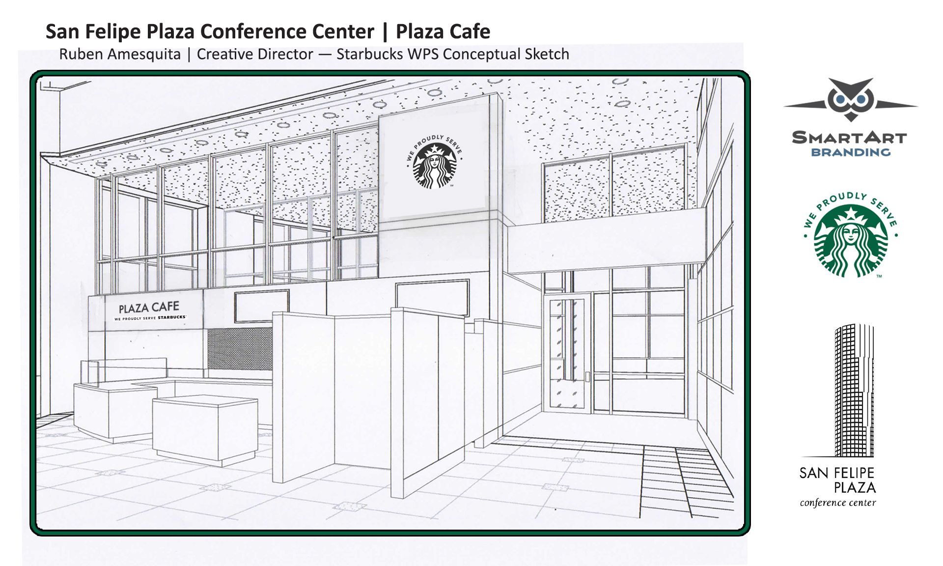
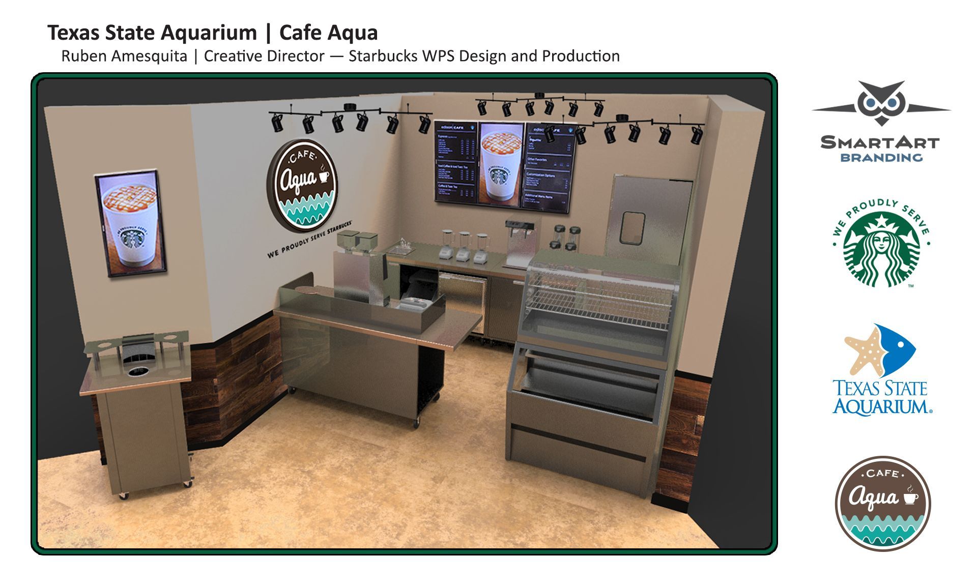
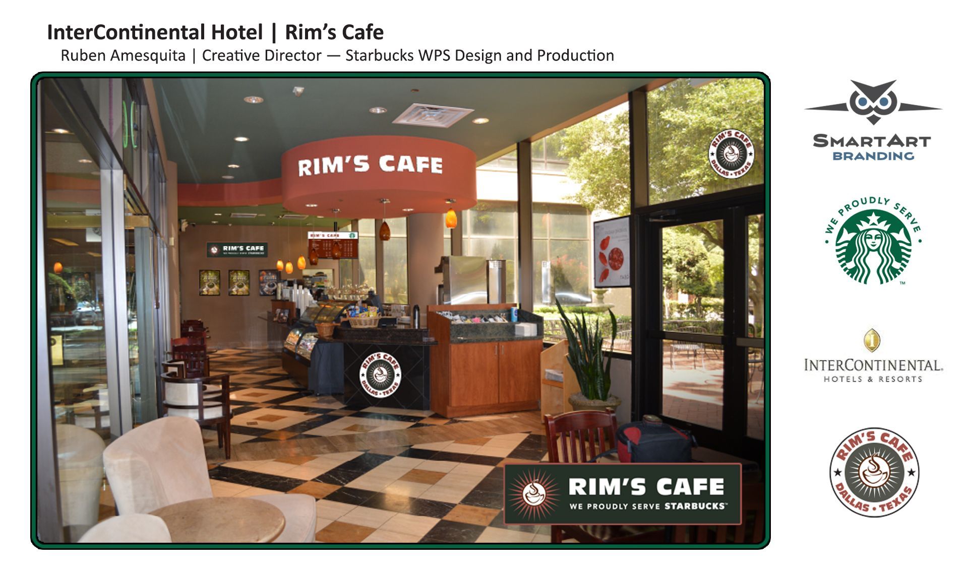
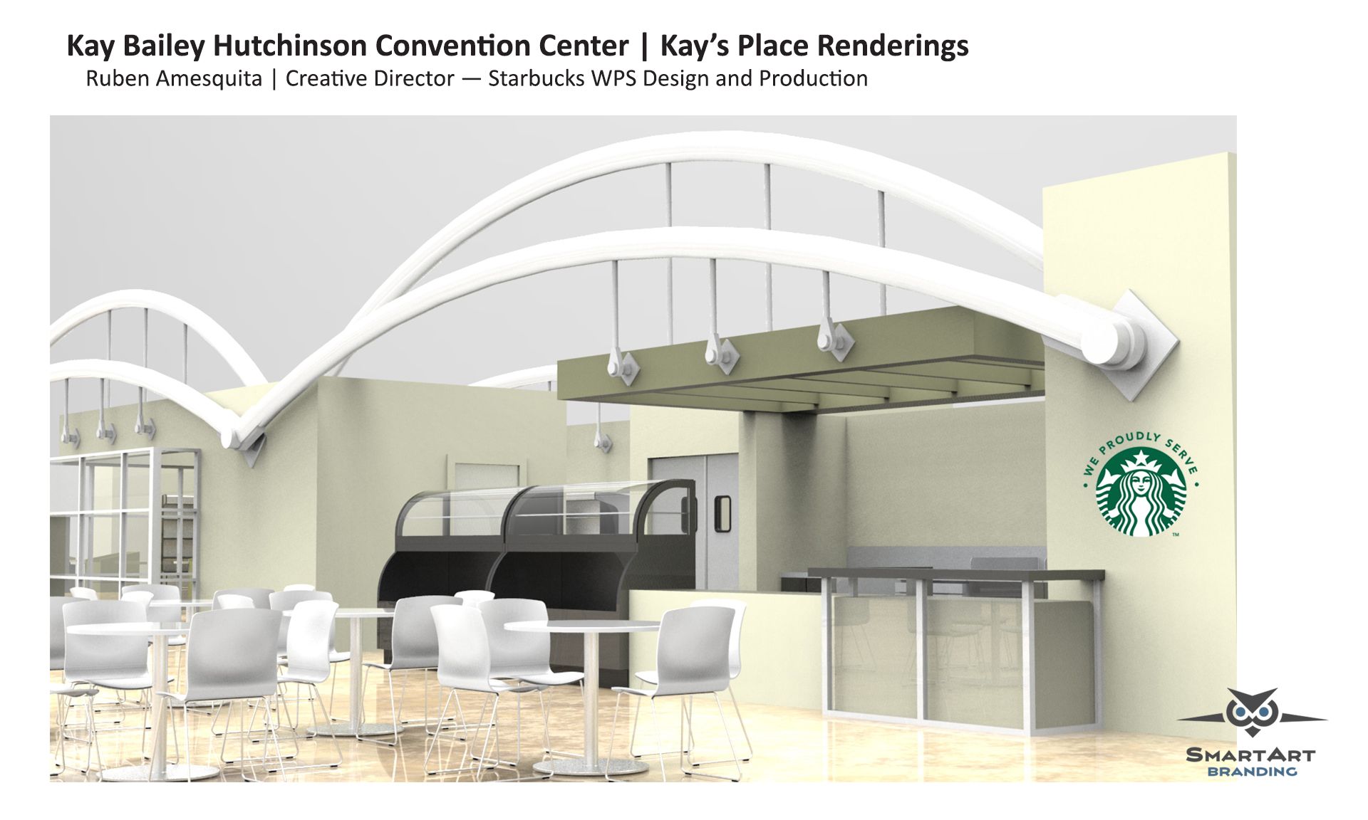
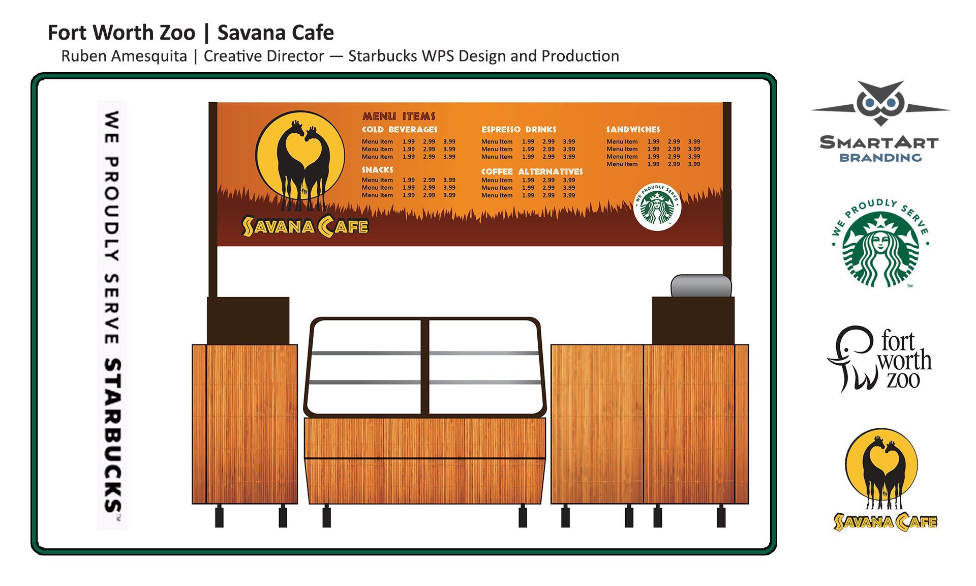
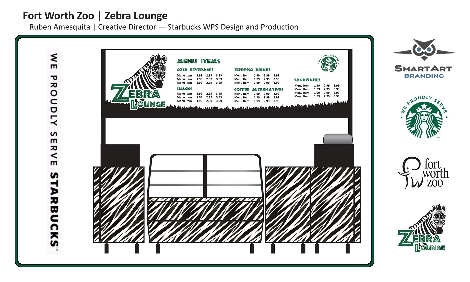
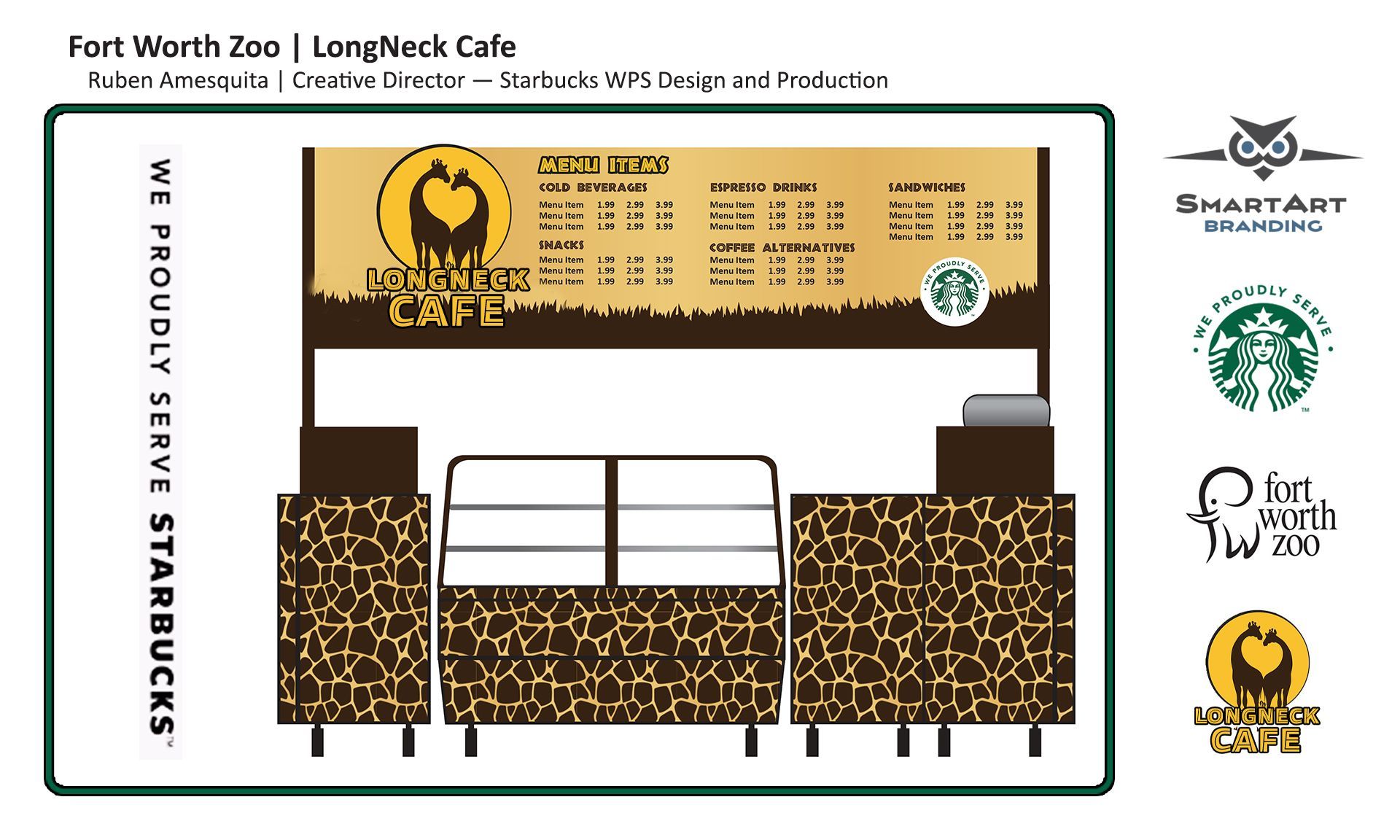
Starbucks | WPS Projects
Over the years, SmartArt Branding has had the privilege of collaborating with several Starbucks WPS accounts. Here are some of our favorite concepts.
Garland Chamber Guide
SmartArt Branding had the honor of spearheading the writing and design of the Garland Chamber of Commerce's Garland Guide from 2018 to 2023.
2023 Garland Guide
Bond Program Issue
The cover of this 2023 issue was deliberately crafted to foster an organic ambiance, seamlessly blending elements of nature with a warm and welcoming atmosphere.
The color palette evokes a sense of tranquility, showcasing soft, muted earth and sky tones that inspire feelings of peace and serenity, ensuring the environment feels harmonious.
View the guide by clicking the link below.
2022 Garland Guide
Revitalized Medical District
The cover of the 2022 issue showcased a blue abstract medical backdrop that emphasized technology.
A sense of contrast and balance was created with the use of both thin and bold white text, while overall harmony was preserved through the thoughtful arrangement of elements.
View the guide by clicking the link below.
2021 Garland Guide
Future in Automation
The cover of the 2021 issue featured muted yellow and white typography, perfectly complementing the overall image.
The background showcases a subtle, abstract technical design that elevates the overall aesthetic.
View the guide by clicking the link below.
2020 Garland Guide
Breaking Tradition
The cover of the 2020 issue showcased three beautiful, empowered women. The image depicted a serene natural setting with green accents that evoked strength while retaining a sense of softness.
View the guide by clicking the link below.
2019 Garland Guide
New. Now. Next.
The cover of the 2019 issue showcased two sturdy gentlemen, accentuated by a vivid interplay of blue and yellow shades sourced from the background image.
The contrasting white fonts blended effortlessly with the overall design.
View the guide by clicking the link below.
2018 Garland Guide
Why Now is the Right Time to Innovate
The 2018 edition featured a number of influential figures in a corporate setting.
Faded black vignetting surrounded the subjects to accentuate their presence, while careful balance in color combinations and positioning created a visually appealing composition.
View the guide by clicking the link below.
Social Media Campaigns
SmartArt Branding has some fun with Social Media!
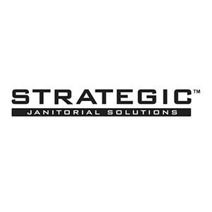
Strategic Janitorial
Bugs and Critters Campaign
Strategic Janitorial has requested the launch of a six-week social media campaign during the spring season, which coincides with the resurgence of ants, flies, and other pests after winter.
Strategic Janitorial provides commercial cleaning services for theaters, day-care centers, restaurants, cafeterias, and offices to help deter these insects and other nuisances.
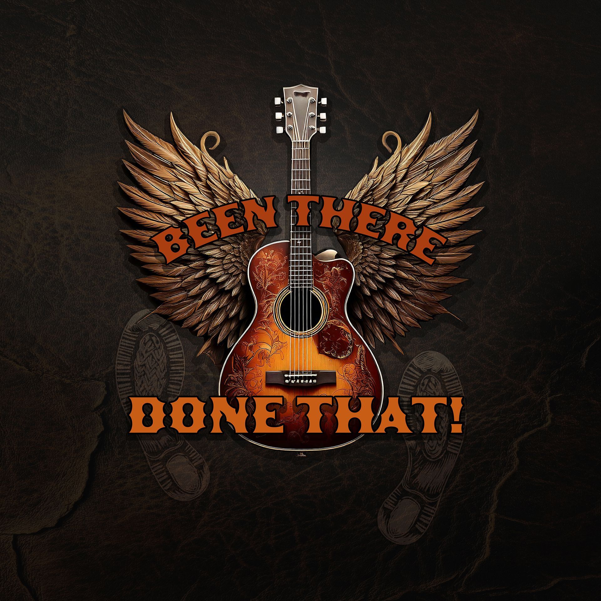
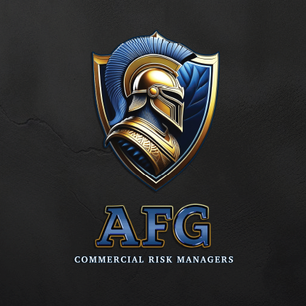
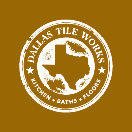
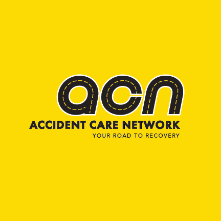
Logo Design Vault
SmartArt has created many logos during the last 25 years.
Here are some of our favorites.


Our Clients
Here is a partial list of great companies we have had the privilege to serve.


CONTACT
Office Hours
- Mon - Fri
- -
- Saturday
- Appointment Only
- Sunday
- Closed
SmartArt Branding
DBA SmartArtBz LLC
Dallas, Texas